Impact
Rolled out in China in December 2018, then to other markets gradually.
- +0% average conversion rate
- −0% checkout-help requests to customer service
- −0% time spent in checkout
The Frame
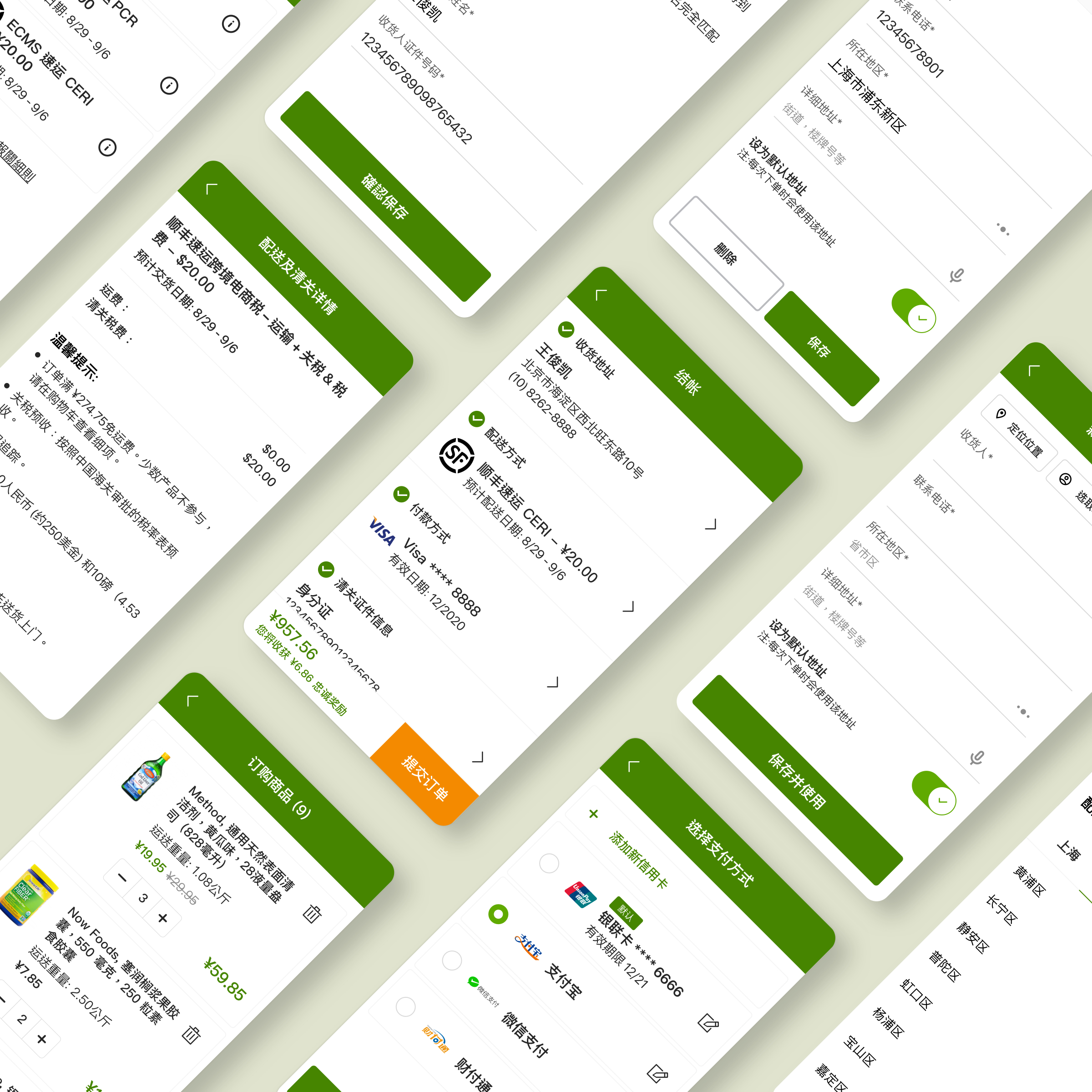
iHerb ships health products worldwide. To support that, layers of shipping, billing, and customs logic had piled onto checkout — and it had become hard to use and hard to maintain.
Three things were missing: consistency (confusing navigation, inconsistent UI), guidance (opaque customs steps, error messages written in jargon), and control (you couldn't review or change anything until the final step).
The goal: a checkout that's consistent, helpful, and controllable — one that builds trust between the customer and the business.
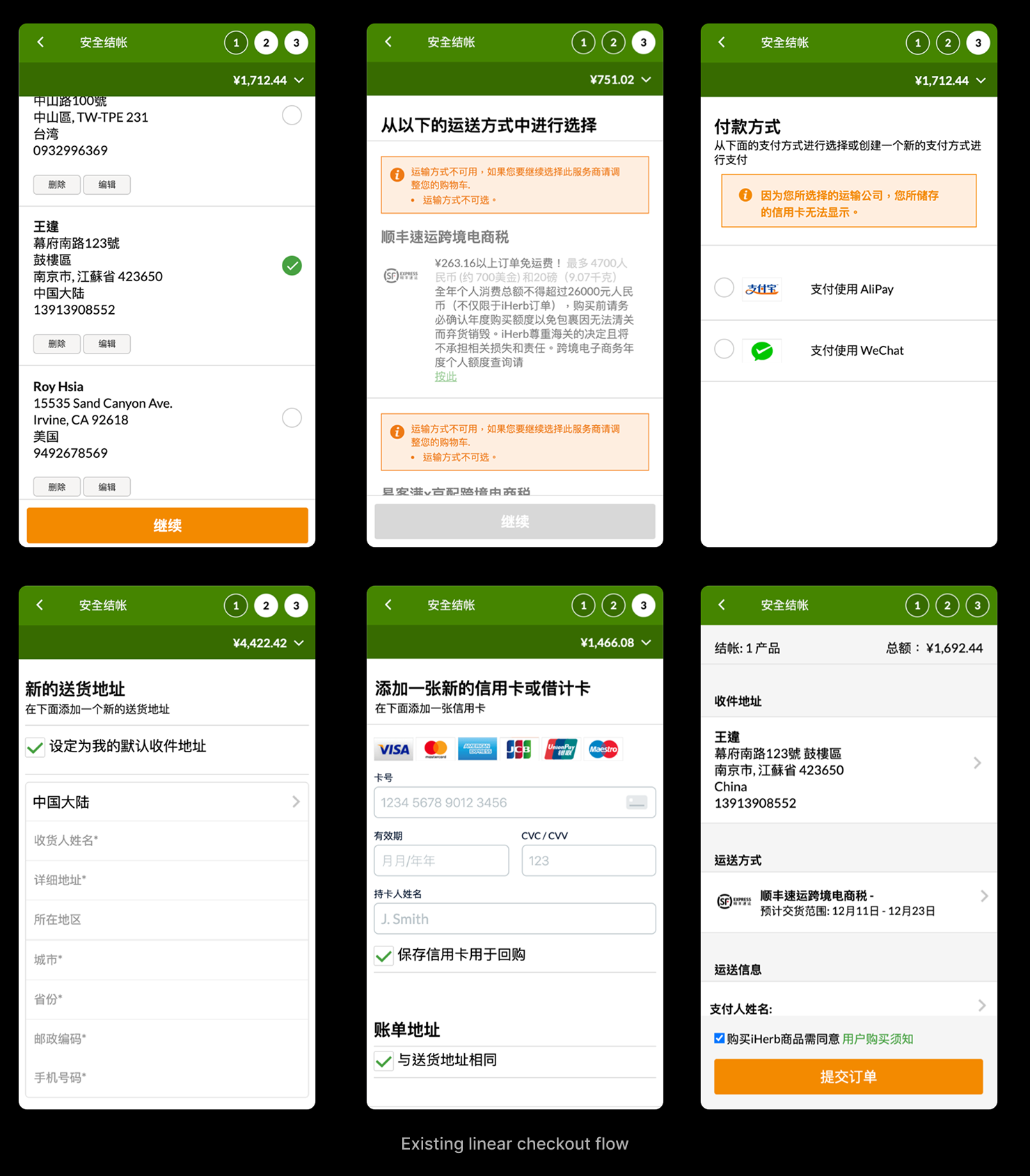
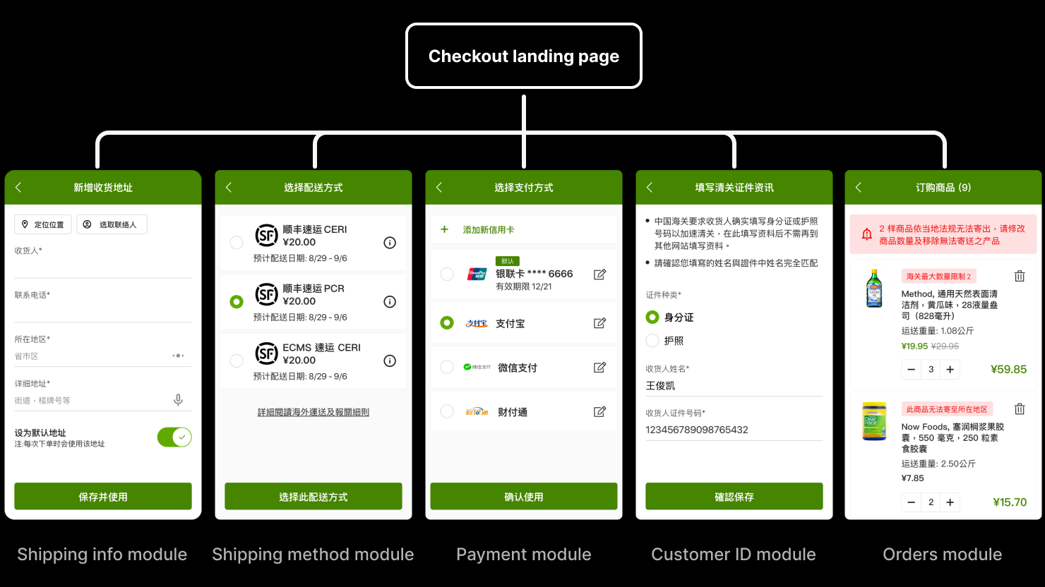
The Reframe — one page instead of a linear flow
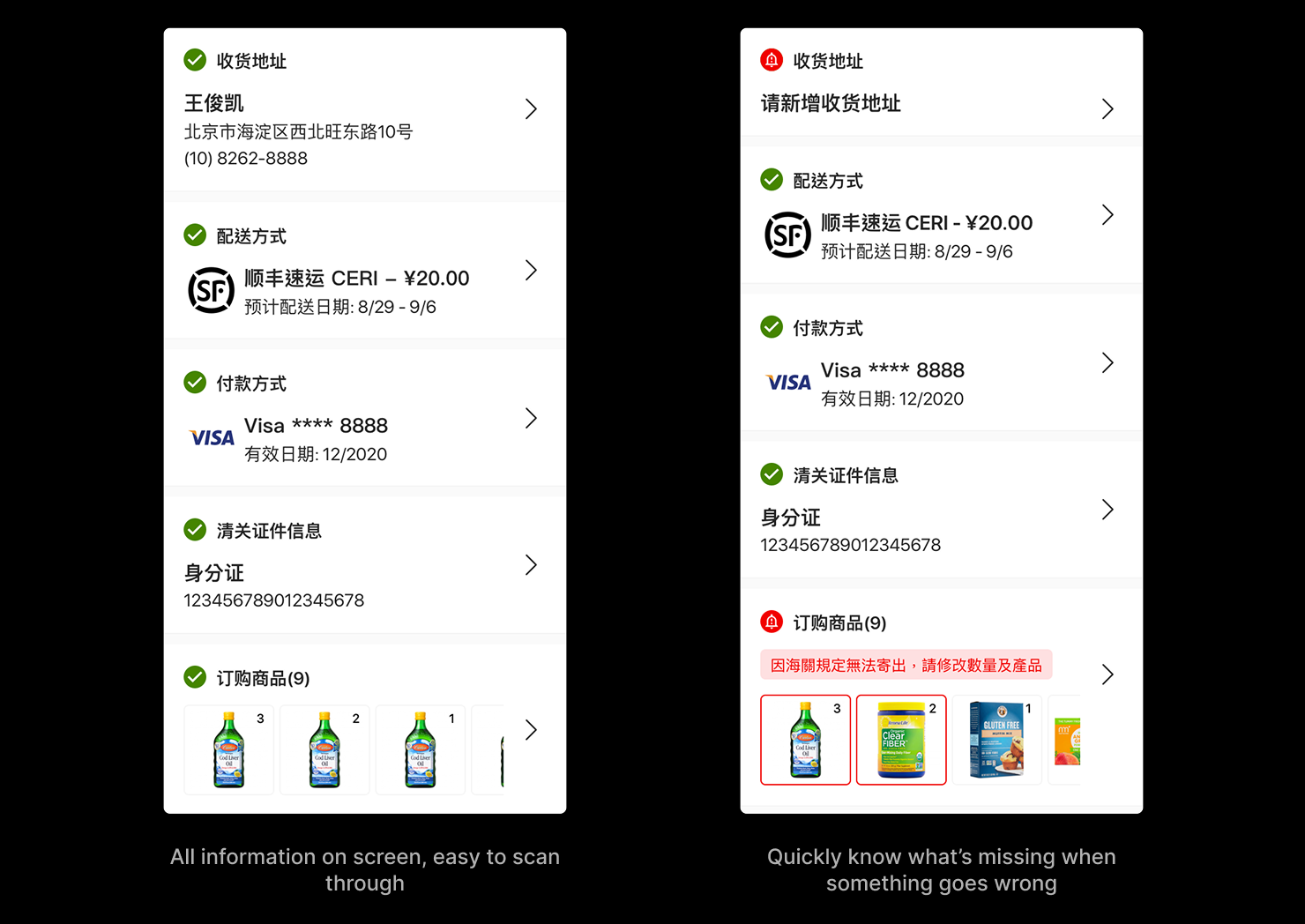
I replaced the step-by-step flow with a single-page model. Every section — address, shipping, payment, customs ID, items — sits on one screen with its own status, so customers can scan the whole order, see what's missing at a glance, jump into any section to edit, and check out in one click as a returning user.
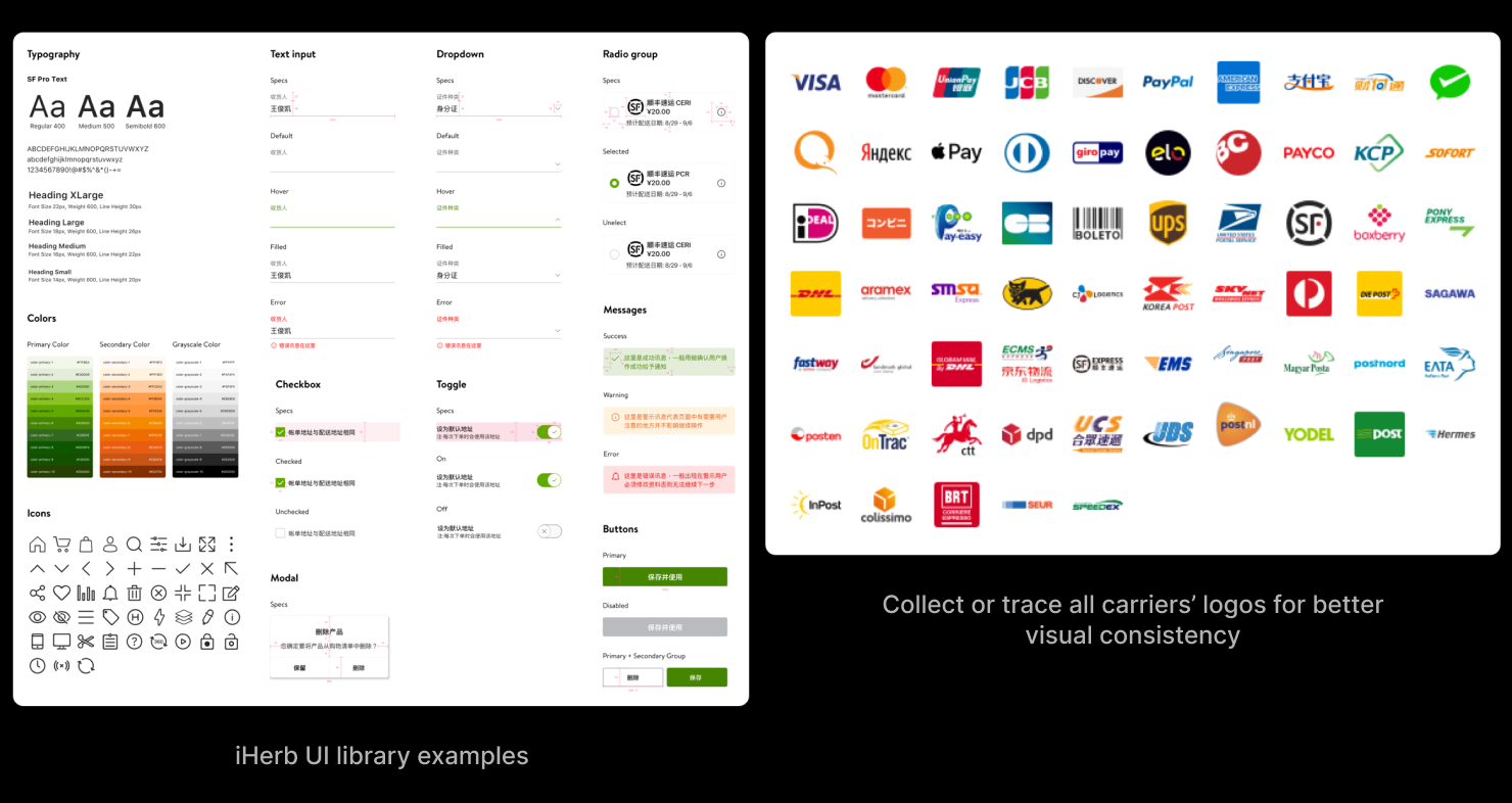
Design System
To make the experience consistent, I built a UI library — typography, color, icons, and the common components with all their states. I defined clickable areas, font sizes, and color contrast for accessibility, and collected or traced every payment and carrier logo so the visual language held together across markets.
Built in Code — the whole checkout, by hand
The strongest argument for the design was a working one. I hand-coded the entire checkout flow as a live, responsive prototype — not isolated screens, the full end-to-end experience — built mobile-first to simulate the app, where it works best.
I built two separate prototypes for two markets. They share the single-page model but diverge where the markets do: the shipping-address entry and the shipping-method step differ, and the Chinese flow adds a customs-clearance ID step the international flow doesn't need.
Two things only a real build could prove out:
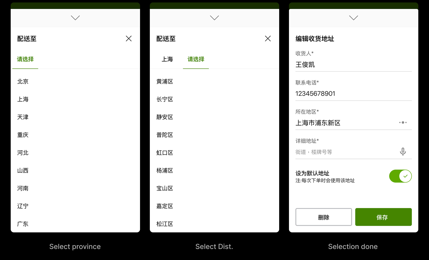
Localized address input — cascading province/district selectors and combined name fields matched how people in China actually enter an address, which improved delivery accuracy.
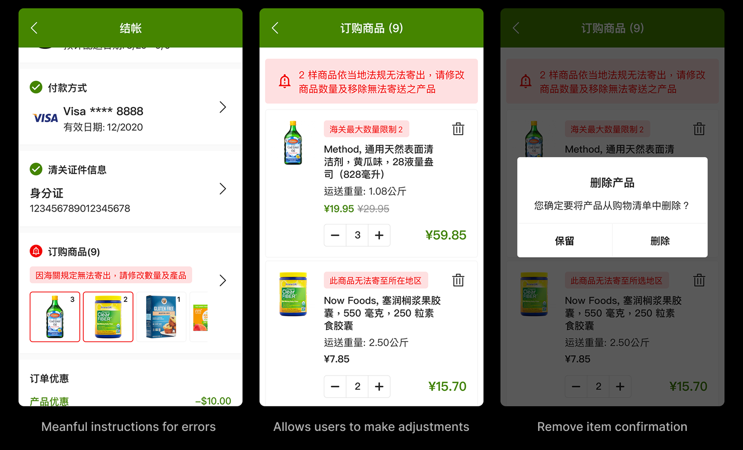
Clear errors, fixable in place — when an item couldn't ship under local rules, the checkout said why and let customers adjust quantity or remove it right there, instead of dead-ending the flow.
Play the live checkout
These are live, hand-coded prototypes — best viewed on a wider screen.
Localized address input
Clear errors, fixable in place
Thoughts
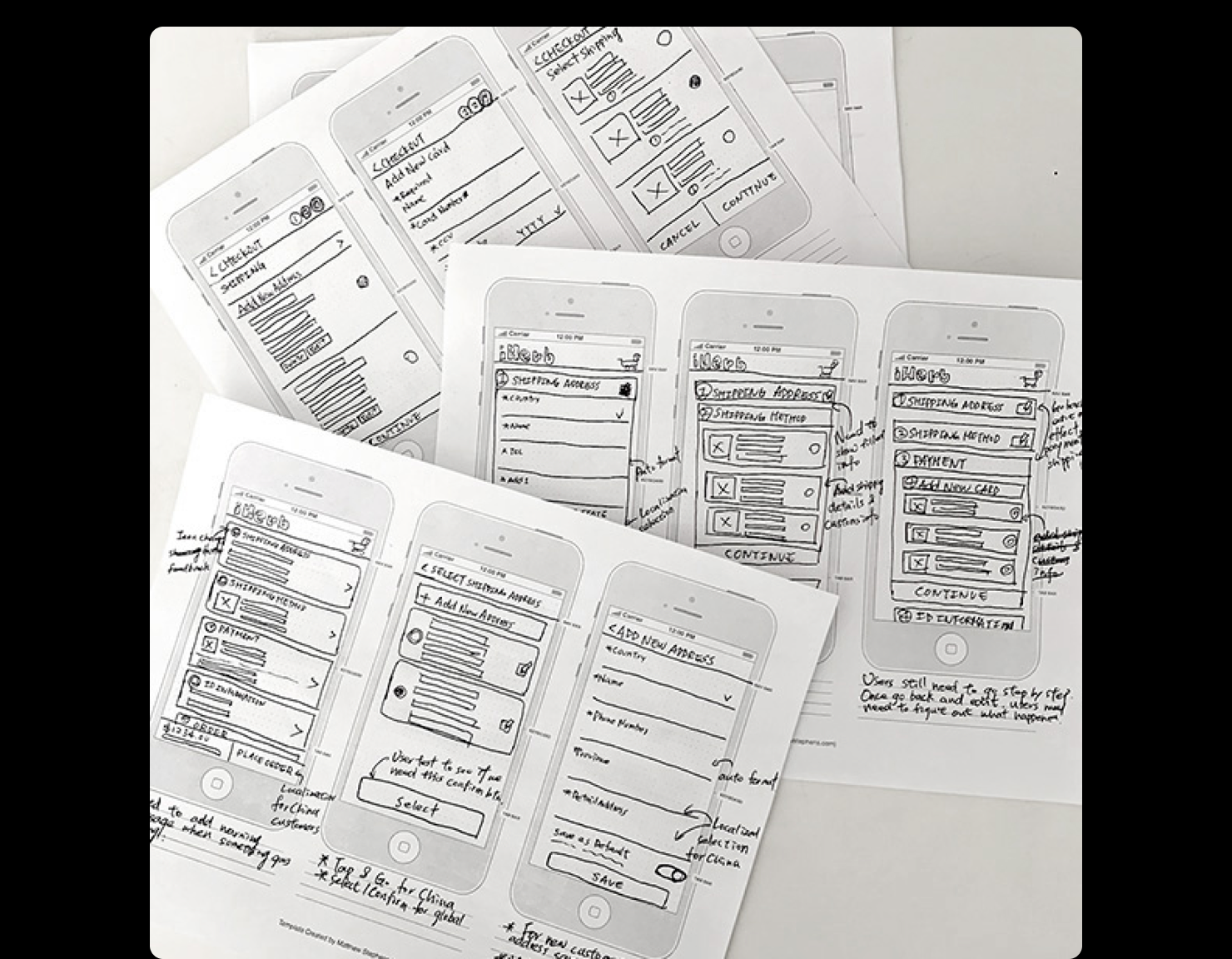
The work started on paper — sketching the whole flow before a pixel existed — and shipped as a measurably faster, clearer checkout. Next steps I'd scoped: card scanning and voice input, combining the shipping and customs modules, and change-of-country edge cases.