Impact
In September 2021, while this work was underway, TikTok crossed 1 billion monthly active users — the fastest social platform ever to reach that mark. By the end of that year, tiktok.com was the most-visited domain on the internet, overtaking Google for the first time (Cloudflare, 2021). That was the scale the desktop experience had to live up to.
Against that backdrop, the program met its own goals: video views, playtime, and active days per capita all rose against their 2021 PC web targets, alongside sound/volume-control and browse-mode navigation penetration. The experiments that landed moved their target metrics — and nothing we shipped came at the cost of the core consumption experience.
As of today, the immersive single-video backbone we built still ships on TikTok PC web.
The Frame
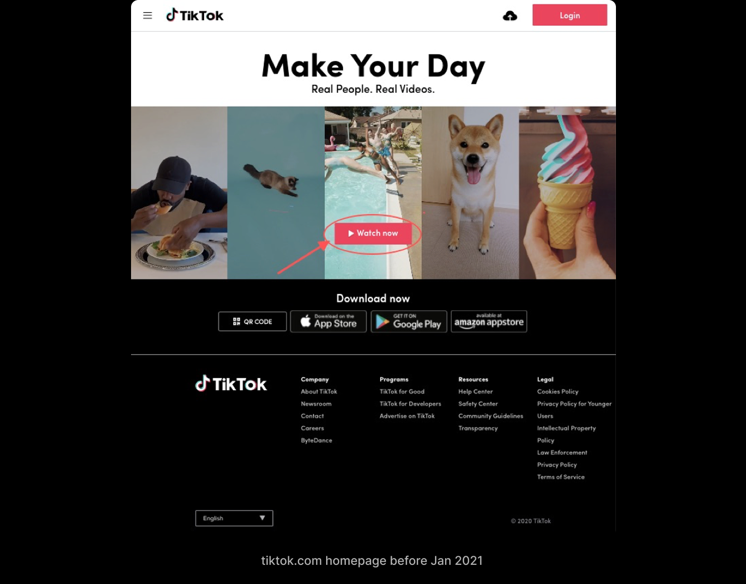
For most of its life, TikTok on PC web wasn't a place to watch — it was a place to download the app. "Make Your Day. Real People. Real Videos," a wall of marketing, a Watch now button that mostly pointed you at the App Store. Then the strategy changed: the desktop was meant to become a real consumption surface, using the big screen to deepen retention and stickiness instead of routing people back to mobile.
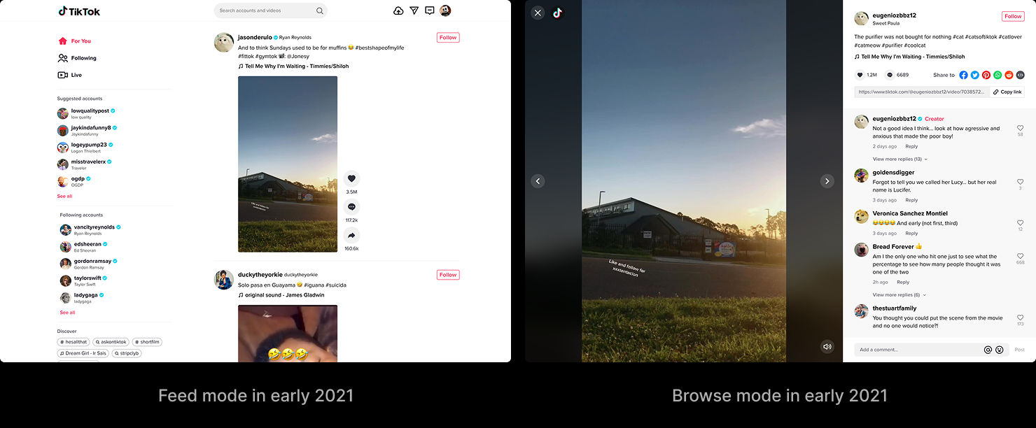
The experience that existed to meet that goal had been inherited, not designed for it. It carried two modes side by side. Feed mode was an Instagram-style grid you scrolled forever. Browse mode was a single-video deep dive you reached by clicking a card, with the comments off in a separate panel. Both worked. Neither felt like TikTok. The whole thing read like Instagram on a big screen — and the people on that screen knew the difference, because the overwhelming majority of them were already heavy app users. They came to the desktop to watch while they multitasked, or at home in the evening; they wanted the single-video immersion they had on their phones, more control over playback, and an easier way to reach what they'd come for. What they got was white space and a long scroll.
As the design lead for the surface, I owned it end-to-end, working with PM, data, research, and engineering across Beijing, Shanghai, and LA.
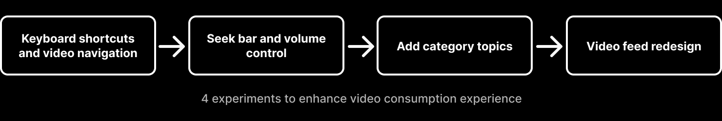
This was never four small projects. It was one question — what does TikTok video consumption feel like on a desktop? — pursued in four shippable pieces so each could be measured and feed the next. The goal wasn't four wins. It was one consumption experience that finally felt like TikTok.
One Experience, Three Directions
Research pointed at three things standing between PC web and that experience. The four experiments each sat under one of them.
Usability — the cost of watching and controlling a video was too high for a keyboard-and-mouse screen.
Discoverability — people couldn't easily get to the videos they actually wanted.
Visibility — the experience wasn't immersive; size and layout were fighting the video instead of serving it.
Usability — lowering the cost of watching and controlling
The desktop has a keyboard and a mouse. The inherited experience barely used either. Two experiments closed that gap.
Keyboard shortcuts and a fixed navigation direction
Hypothesis: more video views, and higher navigation penetration in browse mode.
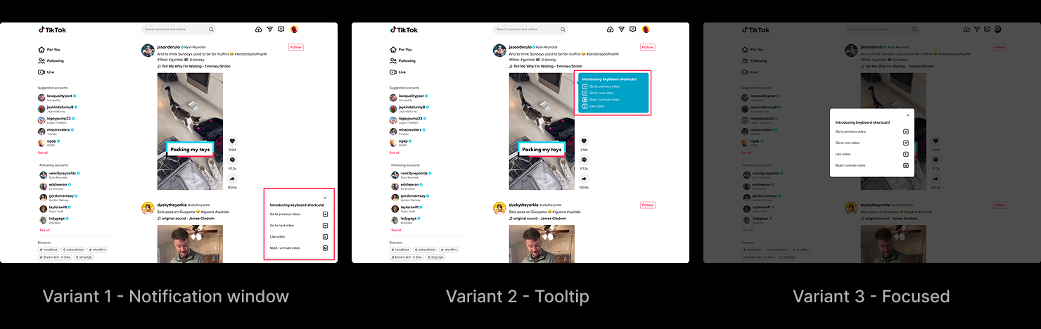
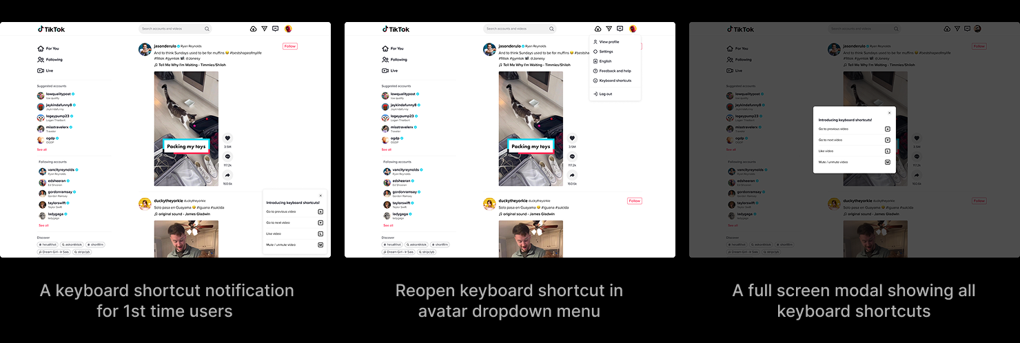
The first added keyboard shortcuts and fixed the direction of video navigation. New visitors met a small notification introducing the shortcuts — previous and next video on the arrow keys, like and mute one key away — and could reopen the full list any time from the avatar menu. How to introduce them was its own decision: a tooltip faded before anyone read it; a full-screen modal interrupted the video to make its point. The notification window won because it was the only option that raised awareness without costing a second of consumption. In the same pass, the navigation arrows in browse mode moved from left-and-right to up-and-down, so the gesture matched the mental model people already had from scrolling the feed.
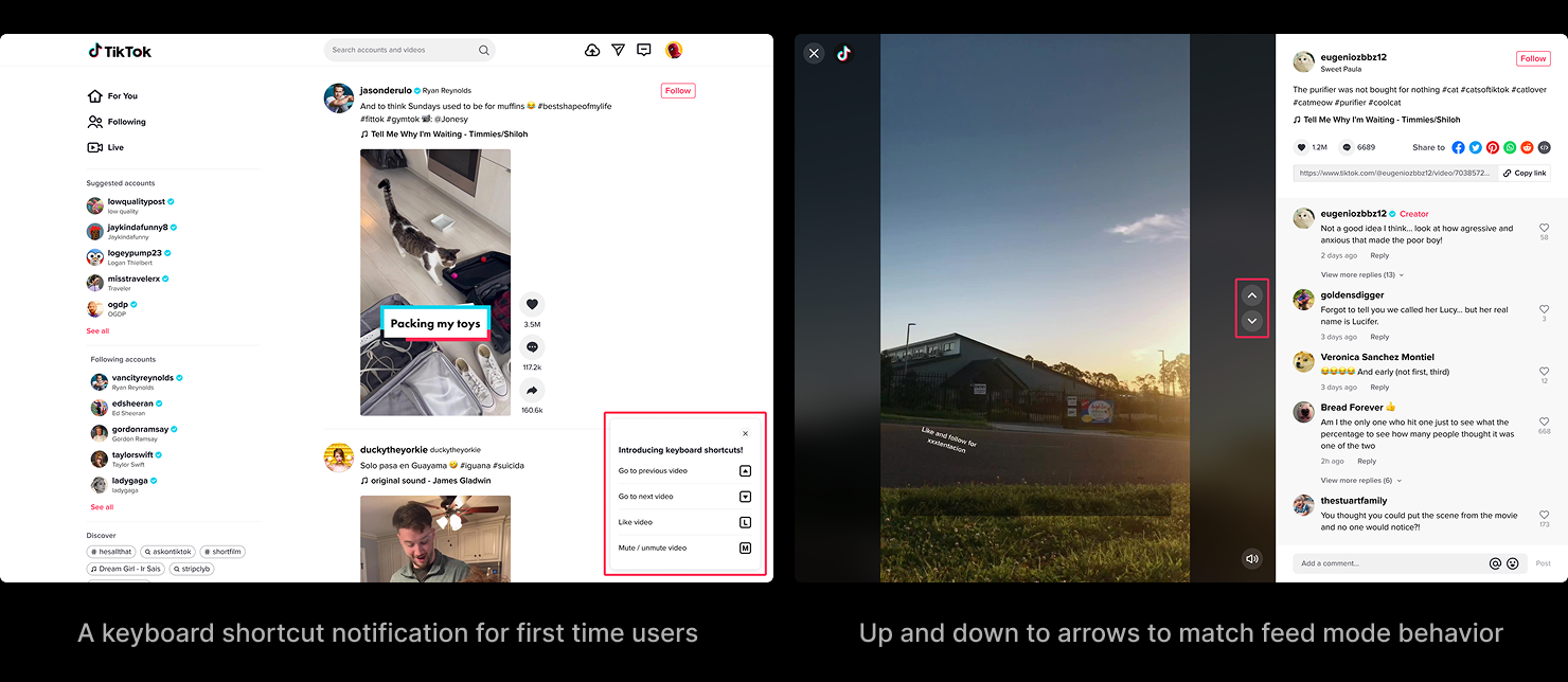
Keyboard shortcut design variants
Keyboard shortcut user flow
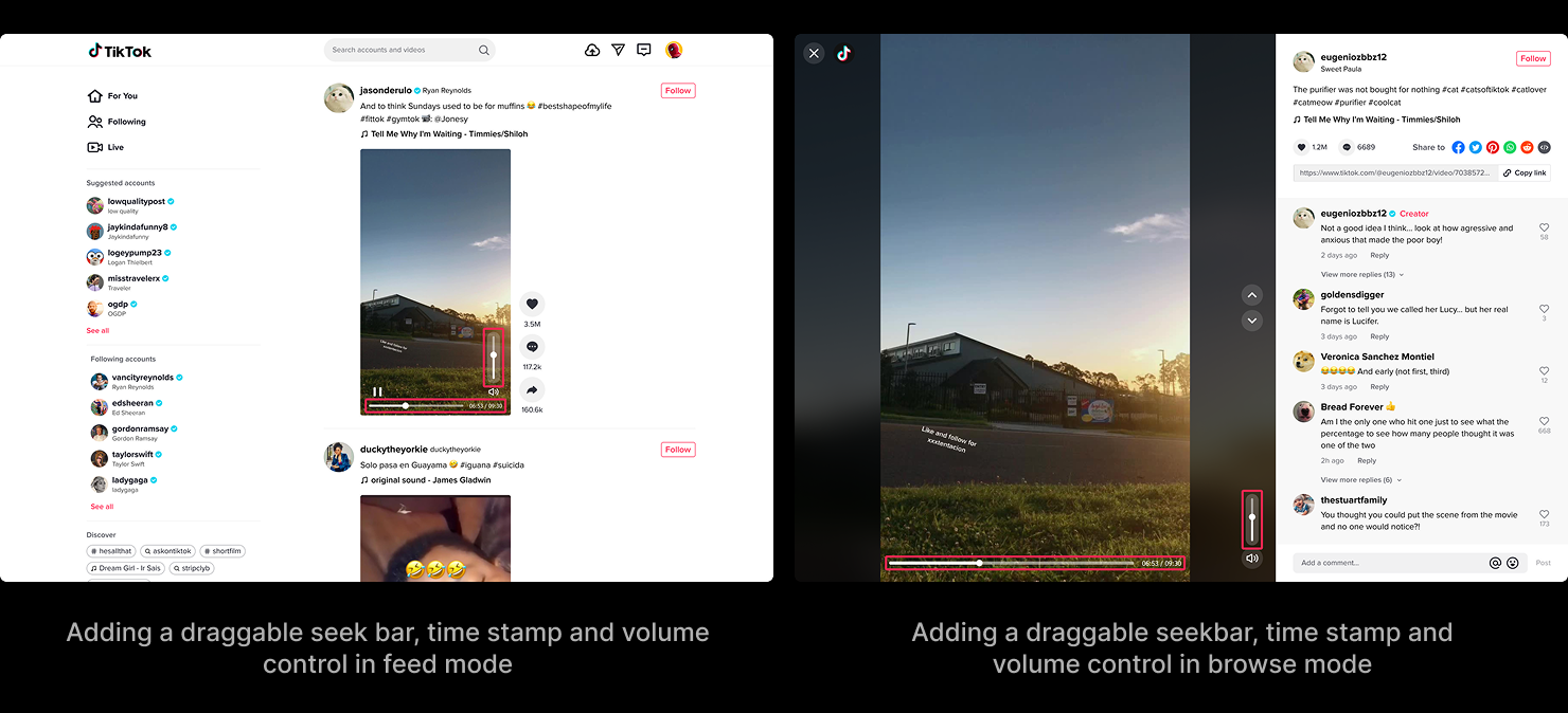
A draggable seekbar and real volume control
Hypothesis: longer playtime and better retention.
The second experiment gave the video a draggable seekbar with a timestamp and a real volume control, in both feed and browse mode — the direct playback control a touchscreen can't offer and a mouse expects.
Together they did what they were meant to. Video views and playtime rose, browse-mode navigation penetration rose, active days per capita rose, sound and volume-control penetration rose — and none of it cost anything on the consumption side.
Discoverability — helping people get to what they came for
If people came to the desktop to watch what they liked, the experience should help them get there faster.
Hypothesis: given a way into topics, people watch more per session and get more out of PC web.
We added seven popular topics — Comedy, Gaming, Food, Dance, Fashion, Animal, Sports — as entries in the left navigation, each opening its own video feed. There was a second option on the table: the same topics as a row of tabs sitting above the videos. We rejected it at the time for two reasons — it read like a filter but behaved like a brand-new feed, and it couldn't show every category at once the way a vertical list could.
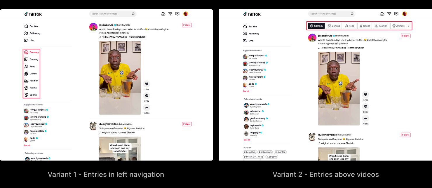
The hypothesis didn't hold the way we built it. Video views ticked up, but play duration per view fell, and retention didn't move. The problem wasn't topics — it was that opening one meant leaving the video you were in and starting a fresh consumption flow somewhere else. The cost of that context switch outweighed whatever the topic was worth. The lesson was specific and it stuck: discovery has to happen inside the consumption flow, not in a branch off the side of it. (Years later, that lesson and the option we rejected both came back — more on that below.)
Visibility — making the experience immersive
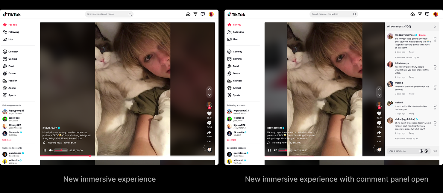
This was the heart of it. The two inherited modes had to become one immersive flow built around a single large video — the thing that makes TikTok TikTok, on a screen big enough to do it justice.
Hypothesis: immersive single-video viewing — the mobile model, sized up — beats a feed-style grid on stickiness and playtime.
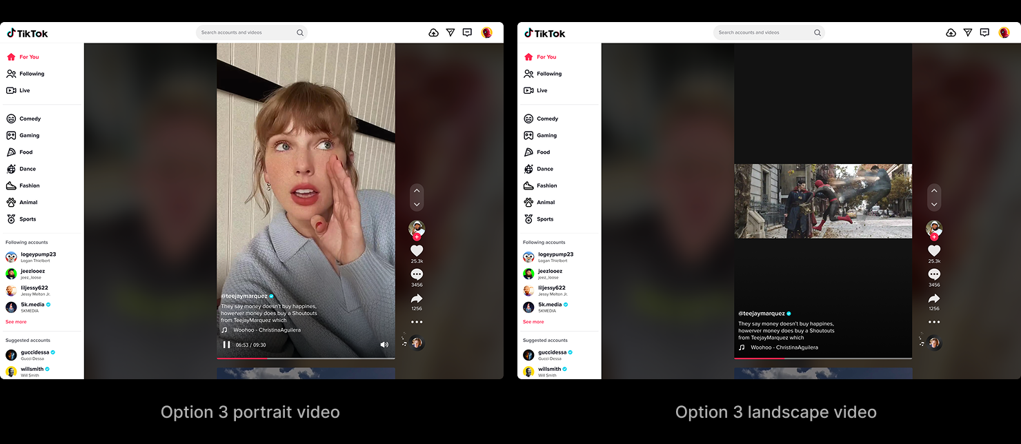
The redesign collapsed Feed mode and Browse mode into one: a large center video, the left navigation, the interactions stacked down the right, volume at the top, a draggable seekbar at the bottom, and a sliver of the next video peeking up from below to keep the scroll affordance the old feed had. We explored three layout variants, each in portrait and landscape, because the desktop has to hold both orientations and the trade-offs between them were the whole problem.
Option 1 kept the interface consistent and the landscape video large and responsive, but the context around the video was only acceptable. Option 2 fixed the context and kept the video large, but the interface positions shifted between orientations and landscape responsiveness suffered. Option 3 held context and consistency and responded well — but it got there by shrinking the landscape video. Each one bought a strength by paying somewhere else.
Built in Code
You can't judge any of this on a static canvas. The differences between the three variants lived in motion — how the feed scrolled, how the comment panel expanded, how the volume scrubbed, how one video gave way to the next across portrait and landscape. So I hand-coded two of the variants as standalone HTML prototypes with full interaction fidelity — scrollable feed, expandable comments, draggable volume, click-through navigation — and stakeholder reviews ran on the live prototypes, not screenshots.
Option 1
See prototype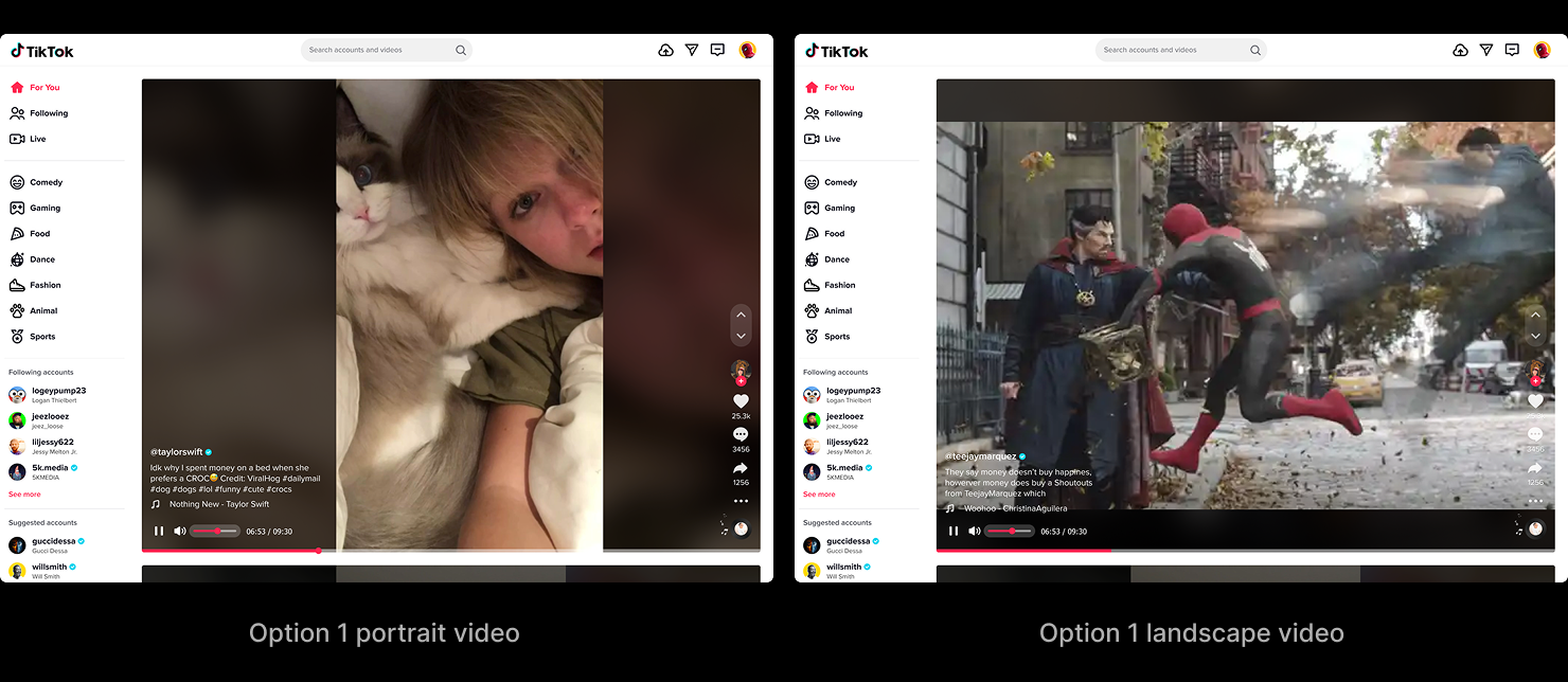
Option 2
See prototype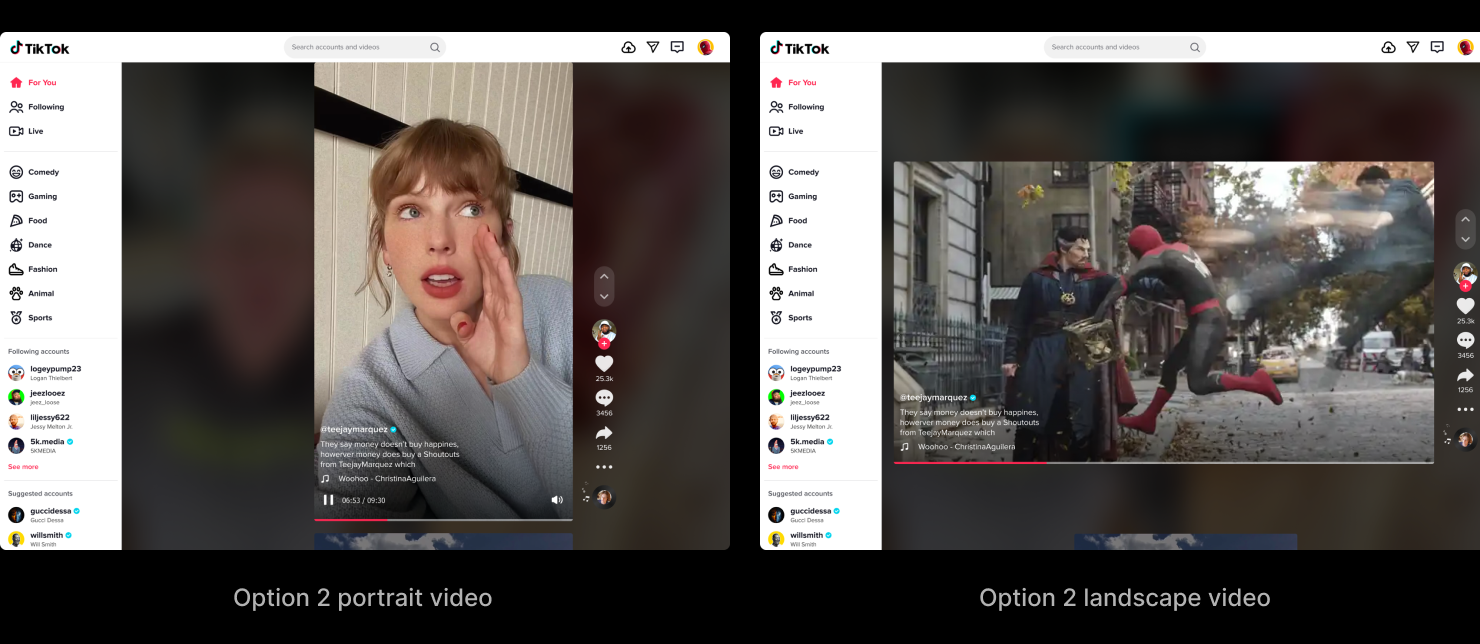
By the time we reached the third variant the prototypes had already answered the open questions, so we worked Option 3 out on canvas. It was the most consistent and most responsive of the three — but it got there by making the landscape video small, and that was the one trade I wasn't willing to make. Immersion can't be conditional; a video that shrinks the moment it turns landscape isn't immersive anymore. The shipped design was synthesized from what the prototypes taught — keeping the landscape video sized for immersion, and accepting a little variation in where the interface sat between orientations.
Option 3
The Video Feed Redesign went into A/B testing in late 2021 and was still running when I left in spring 2022. By then the program's major metrics had already passed their 2021 goals.
Feature vs. Backbone
The redesign's own test hadn't closed by the time I left, so I can't give you its number. The product can.
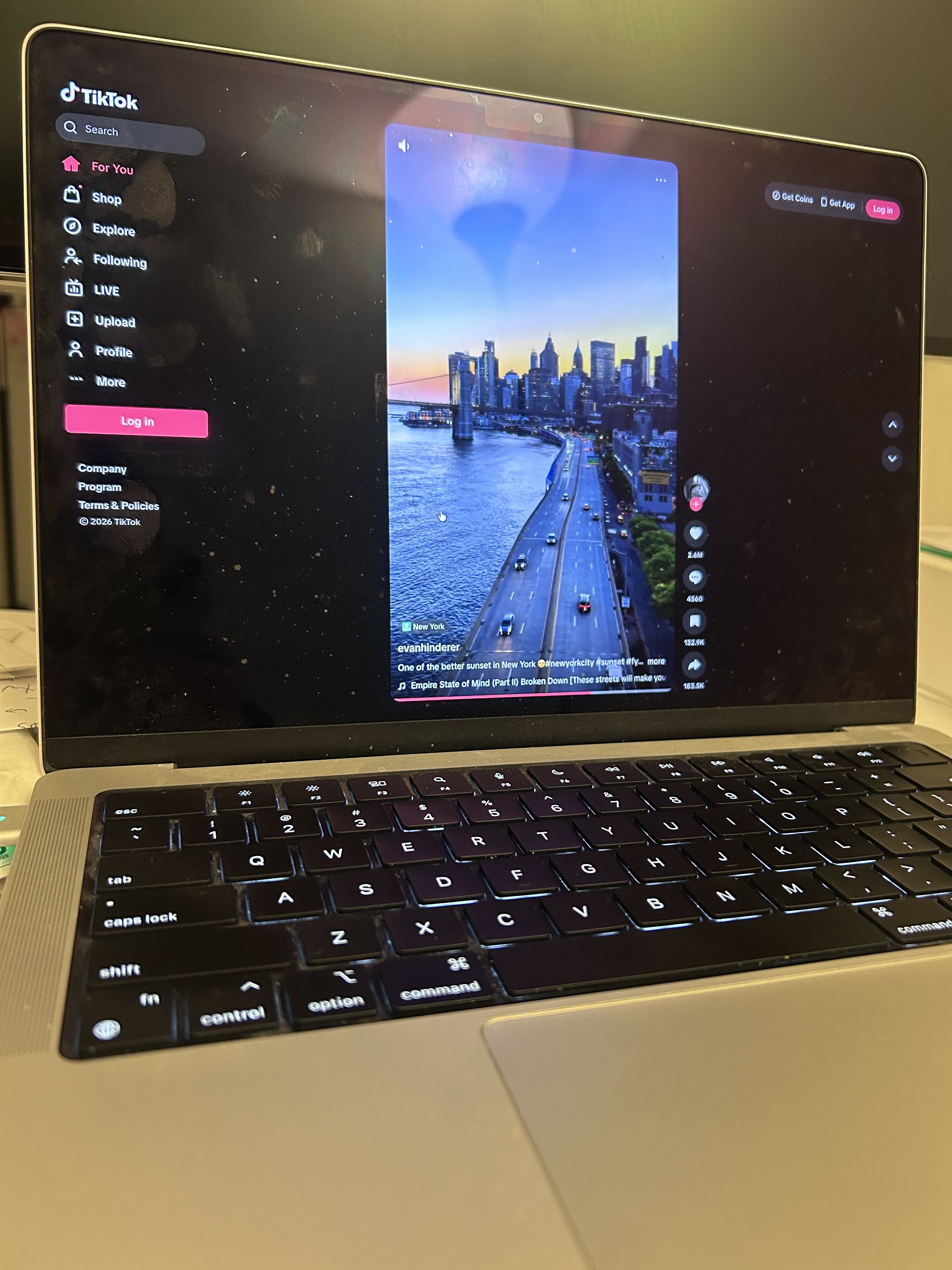
TikTok PC web has no Feed mode anymore. The For You experience is the immersive single video — the large center frame, the left-navigation rail, the interactions down the right, the seekbar along the bottom. That's the backbone we built in 2021. The first thing I look for is the landscape video: it still fills the frame at full size instead of shrinking to fit — the one trade I'd refused when we synthesized the final design, and five years later it's still holding. The controls came through with it: the keyboard shortcuts and the up-and-down navigation, the draggable seekbar, the volume control — moved since, but doing the same job.
One detail did change, and it's the kind of change I like. My version let the top edge of the next video peek up from the bottom — a deliberate cue, for users arriving straight from the old multi-video Feed mode, that there was more below and the page still scrolled. Today's version drops the peek; the video fills the frame cleanly. Both are right for their moment. In 2021 the peek did a teaching job — it told a grid-trained audience this was a feed, not a single clip. Five years on, immersive single-video is the default mental model; everyone knows the next one is a scroll away, so the cue became clutter and got removed. The backbone stayed; the training wheel came off once it wasn't needed.
And the option we rejected for Discoverability shipped — four years later, on the Explore page, as exactly the row of tabs above the videos we'd turned down. What changed was that horizontal scrolling solved the "can't show every category" constraint that had pushed us off it. We hadn't been wrong about the design space; we'd just been early, and missing one affordance. The direction we discarded turned out to be the one that lasted.
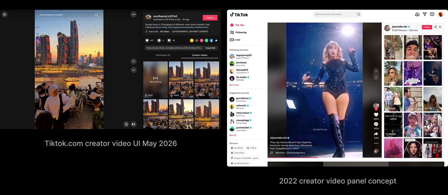
The lesson came back too, and closer to home. One of the future-iteration concepts in my deck was a "rabbit hole" — click the creator on a video and their whole catalog opens in a panel beside it, so you fall deeper into what you're already watching without leaving the flow. I'd framed it explicitly as the in-flow replacement for the topics that failed: discovery alongside the video, not a branch off the side. That panel ships today — moved to the creator's profile page rather than For You, but otherwise the design I'd drawn: open any of their videos and the rest of their catalog fills the panel beside it. Different surface, same idea — keep discovery inside the watching.
Step back from that one entry and the whole left rail tells the same story. The rail still sits where we put it, but what fills it has been almost entirely reallocated. Our version gave creators and celebrities a prominent block — in 2021 the platform was still young enough on desktop to lean on that star power to make the case for watching here at all. Today the block is gone; the scattered topics have gathered behind a single Explore entry, and a Shop has taken the room beside it. It reads like a product that matured past needing to borrow star power or coach discovery — people already know why they're here, so the rail stopped selling the experience and started routing between functions. The screen kept the backbone; the rail beside it is a map the product redraws as its priorities move.
What I took from the whole thing is the difference between a feature and a backbone. Features get added and quietly removed — the next-video peek was one of mine. A backbone is the thing everything else gets layered onto, and you defend it differently because of that. The four experiments looked like four features while we were shipping them. What we were actually building was the backbone — and five years of the product layering onto it, without replacing it, is the proof.