Impact
- 0%+ acceptance of customer-preferred substitutions
- 0% further reduction in refunds for unacceptable substitutions
- +0pt CSAT
- $0M+ cumulative retention impact across the substitution program
Context
Project 1 cut refunds for unacceptable substitutions in half. It did this by giving customers control — the power to review and decline a substitution after the fact. But control and acceptance are different problems. Declining a bad replacement never produces a good one. Acceptance of substitutions still rose, but it rose least — and Project 1's results named it as the expected soft spot, the one metric a reject-only flow couldn't push hard, and scoped the fix to the next project: customers needed to shape the substitution before it happened, not just reject it after.
All of this traced back to the seven customer insights the substitution work began from. Project 1 had resolved three of them from the recovery side. Four remained — and all of them lived upstream of the picking moment.
Communication
- I was not aware of this feature until check-out
- Will I be charged for substitutions? How do I return unwanted items? ✓ solved in Project 1
- I want to receive notifications while shopping if items are low in stock
- I would love it if I could receive a substitution notice before pick-up time ✓ solved in Project 1
Control
- I'm very picky about certain items. I'd like to choose my replacements
- I like to have the flexibility to change and edit my preferences
- When is the option given to decline substitutions with a delivery? ✓ solved in Project 1
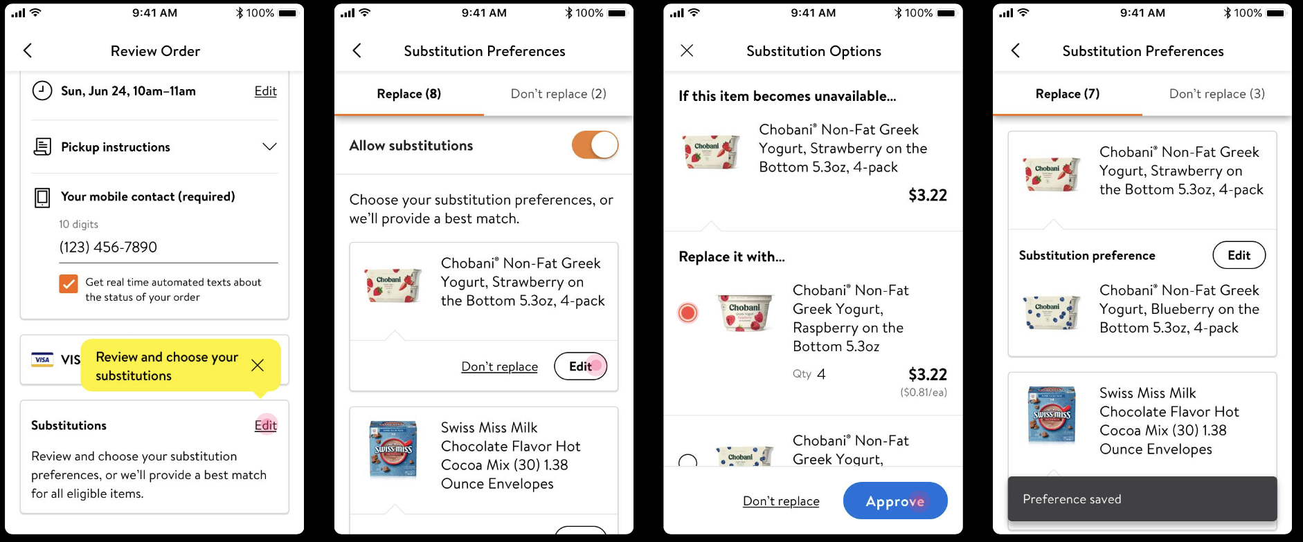
The second project intercepted at the two moments where intent could be captured before a substitution was ever made. Customer Choice prompted the instant a low-in-stock item went into the cart, letting customers name the replacement they wanted in case it ran out. Review & Edit gave one place to set and change substitution preferences across the whole order — available from checkout through the order's amend window, before picking began.
Project 1 made substitutions recoverable. Project 2 made them match.
The Architecture
Two design layers, addressing the four remaining insights through the pre-substitution flow — capturing intent at the low-stock moment, and managing it across the whole order before picking began.
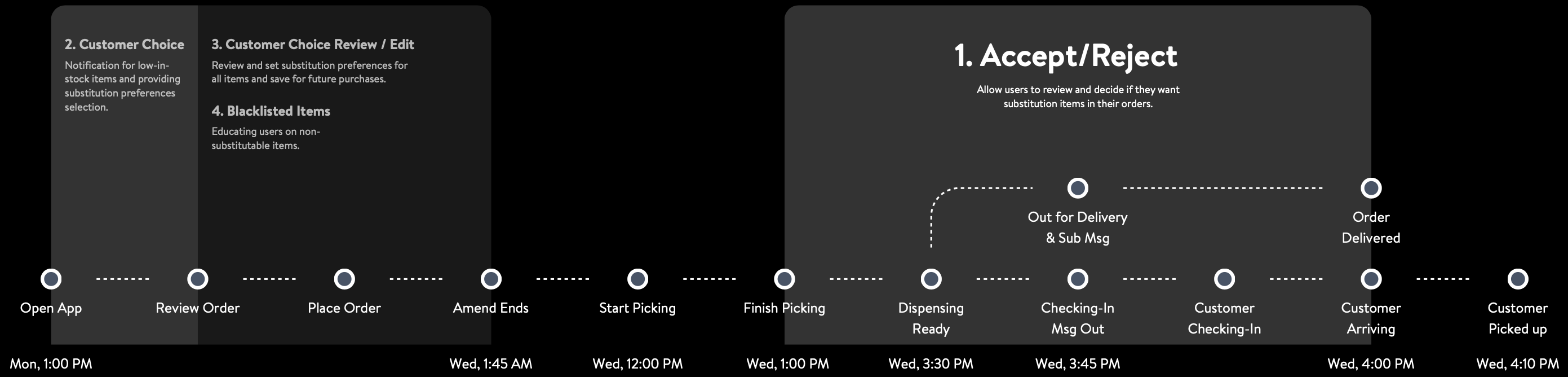
Full substitution journey · solving touchpoints 2, 3, 4
Customer Choice — capturing intent at the low-stock moment
Addresses: “I was not aware of this feature until check-out” (#1) · “I want to receive notifications while shopping if items are low in stock” (#3) · “I'm very picky about certain items. I'd like to choose my replacements” (#5)
The moment a low-in-stock item went into the cart, a prompt asked the one question that mattered: if this item is unavailable, what would you want instead? Customers picked their own replacement from the available options, or declined a replacement entirely — then a short confirmation closed the loop.
One prompt answered three pains at once. It surfaced the feature while customers were still shopping rather than at checkout (#1). It was itself the low-stock notification they'd asked for (#3). And it let the picky customer name the exact replacement instead of leaving it to the algorithm (#5).
The prompt was capped at five per order. Order data showed an average of 1.6 substitutions per order, 2.5 for orders that had any, and 95% of orders with five or fewer — so the cap matched real behavior and kept the prompt from turning into noise. It lived on a separate page to reduce that noise further, and reused the Accept/Reject pattern from Project 1 to shorten the learning curve.
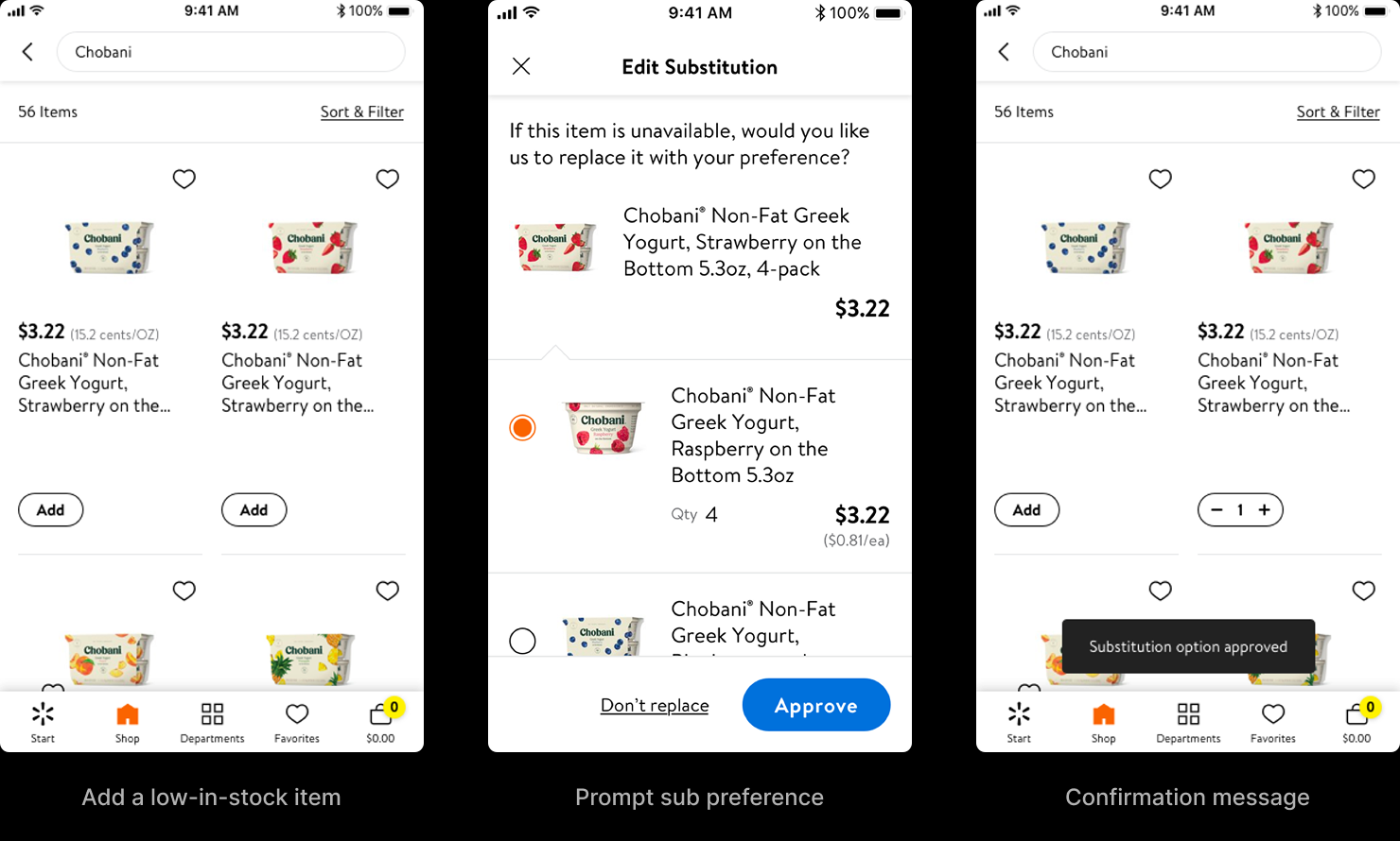
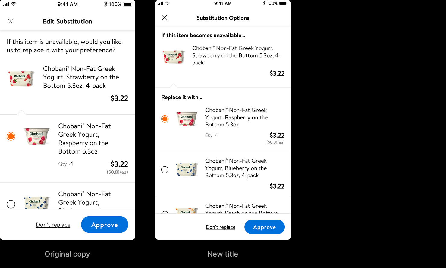
One iteration is worth noting because it shows what testing caught. The first version buried the conditional — three of eight participants missed the word "if" and read the prompt as "this item is unavailable," not "if it becomes unavailable." The rewrite made the condition structural — "If this item becomes unavailable…" as a section header, "Replace it with…" framing the choice — and the misread disappeared.
Review & Edit — managing intent across the whole order
Addresses: “I like to have the flexibility to change and edit my preferences” (#6)
Customer Choice caught items one at a time, at the moment they were added. But a basket builds over 30 minutes to several days, and customers wanted to see and change every preference in one place before the order was locked. Review & Edit gave them that — a single surface to set, review, and edit substitution preferences across the entire order, open from checkout until the order's amend window closed: for next-day orders, 1:45 AM on the fulfillment day, hours before a picker could start.
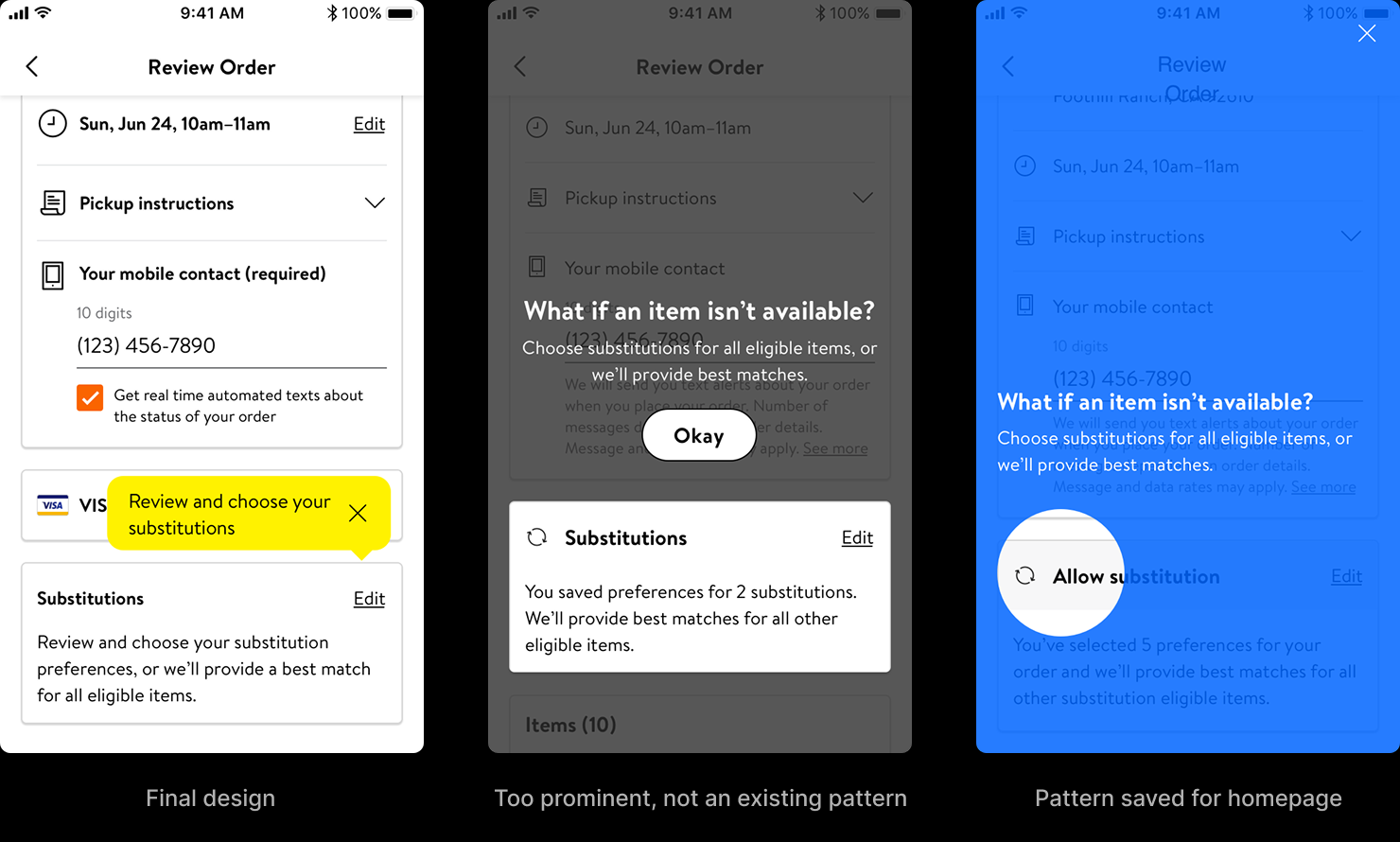
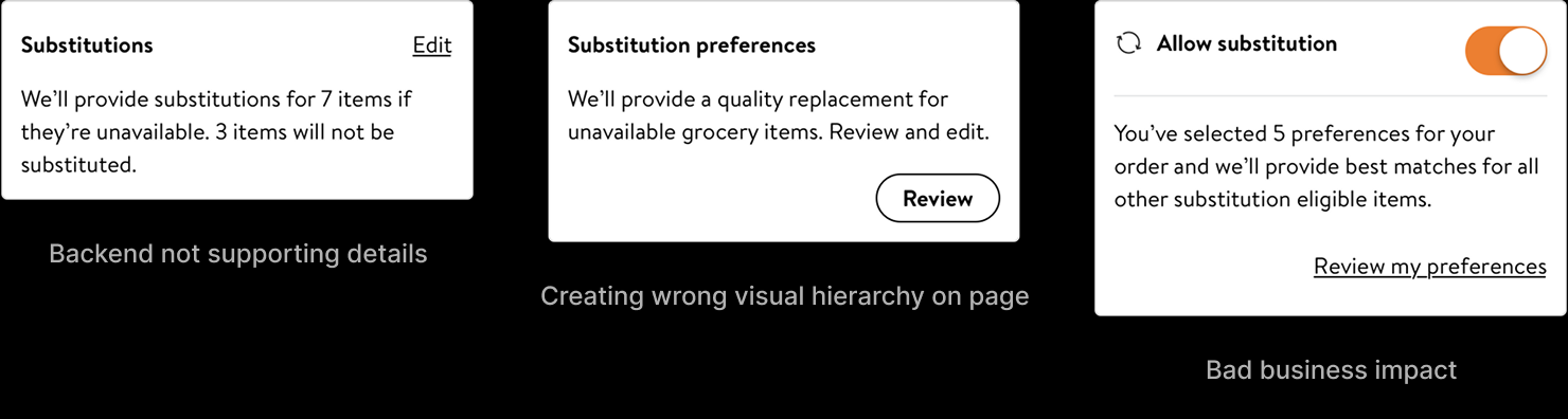
The hardest decision here wasn't the editing screen — it was the entry point. A preference-management surface that's too quiet gets missed; too loud, and it invites customers to switch off substitutions entirely, which is the opposite of the business goal. I explored the full range, and the rejected options were as informative as the one that won. A full-screen "What if an item isn't available?" interstitial was too prominent and broke from any existing pattern in the app. A homepage-style coachmark borrowed a pattern that was reserved for the homepage. An "Allow substitutions" toggle was clear, but it turned killing every substitution into a single tap — easy for the user, bad for the business. And a summary that promised to substitute seven items and leave three alone was honest, but the backend couldn't yet supply per-item substitution detail at that point in the flow.
The winner was the quietest option that still worked: a "Substitutions" section on the Review Order page with an inline edit affordance. It aligned with the existing design system and accessibility patterns, sat at the right level in the visual hierarchy, and needed no new API. The decision balanced five constraints at once — clarity, system consistency, accessibility, backend feasibility, and business impact — and that balance, not the screen itself, was the work.
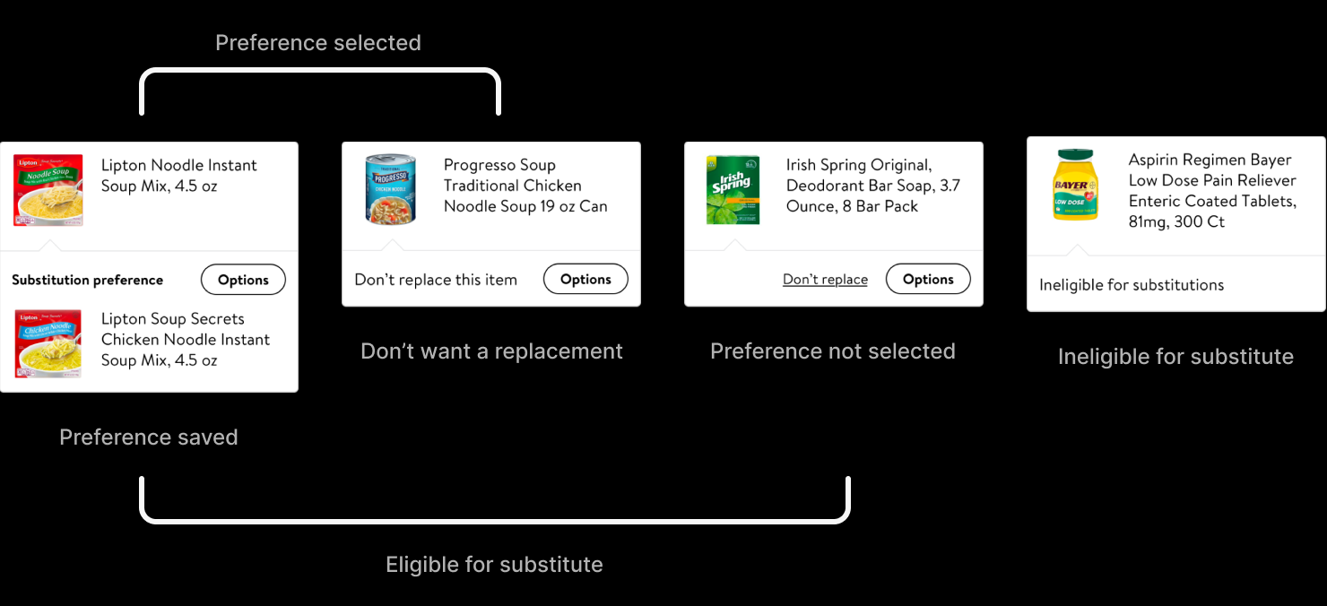
Inside, every item resolved to one of four states: a preference saved, a deliberate "don't replace this," a default "no preference set — we'll pick the best match," or ineligible for substitution at all. That last state did double duty as education — alcohol and medication can't be substituted, and surfacing that inline taught customers the rule instead of letting it surprise them. How those four states should be organized for a real order was the open question — and the one the prototypes were built to answer.
Structure Was the Real Question
Three structures could organize a full order of substitution preferences — a tabbed split, an accordion of collapsible groups, and a filtered list. On a static layout all three looked workable; the differences only showed up in use — how far the eye had to travel to find one item, how much the view shifted as groups opened and closed, how easily a count got lost. Each traded off differently. The tab split kept categories few and the interaction simple, but made a specific item harder to locate. The accordion located items more easily but moved the layout vertically as sections expanded. The filtered list was the most familiar pattern and located items well, but multiplied the categories and made item counts easy to miss.
Tab
See prototype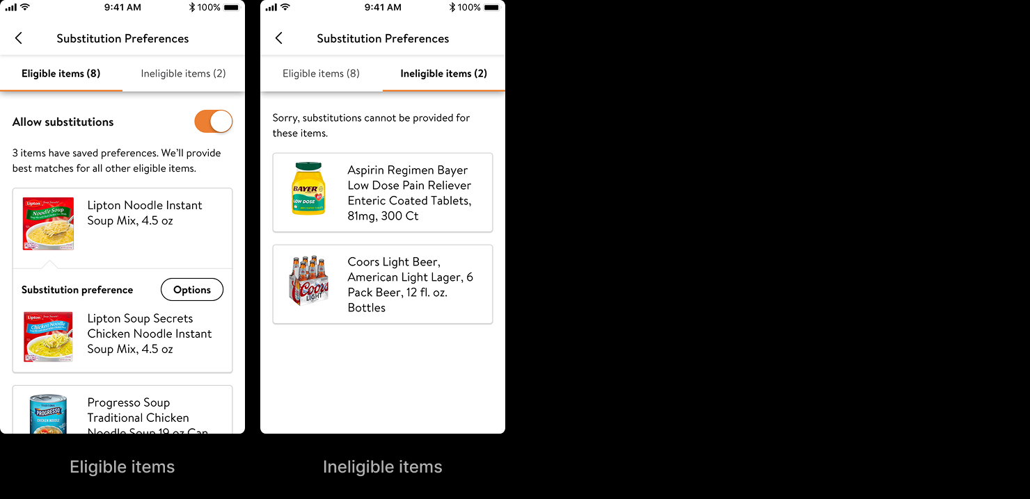
Accordion
See prototype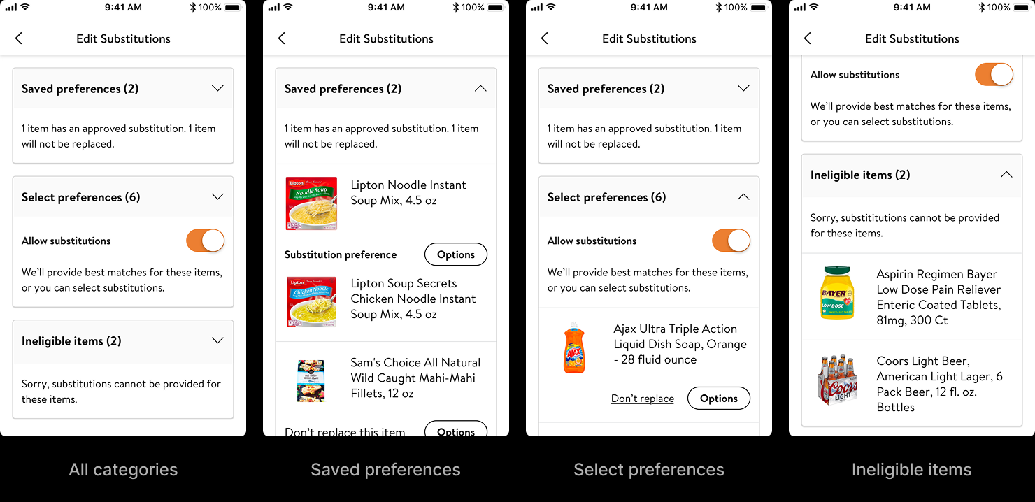
Filter
See prototype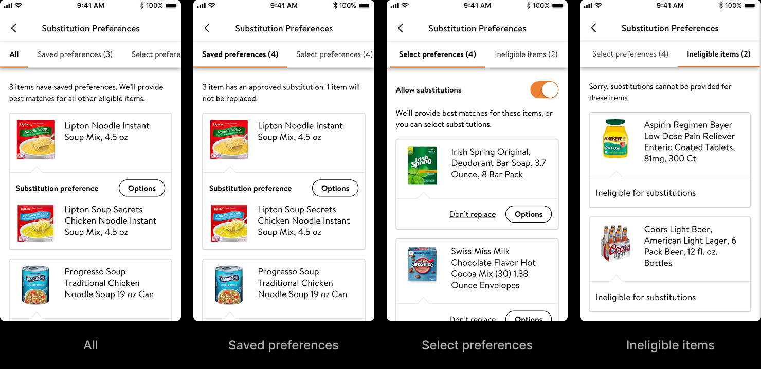
User testing settled the structure, but it also did something more useful: it changed what the structure was about. We had been splitting items the way the system saw them — eligible for substitution versus ineligible. Watching people move through the prototypes, the real question they were asking was simpler and entirely their own: which of my items will get replaced, and which won't? So the tabs were rewritten to answer that question directly — "Replace" and "Don't replace" — instead of describing the system's eligibility model. Same pattern, different framing; the tab model won, now organized around the customer's decision rather than the backend's data.
That was the whole lesson of the second project. The eligibility split read fine on paper. It was only when people moved through a real order that the mismatch between how the system thought and how the customer thought became obvious enough to fix.
Final design
What the Interface Now Says
Together, the two projects closed all seven of the original insights — from the after-the-fact recovery of Accept/Reject to the upstream intent of Customer Choice and Review & Edit. Communication and control across the whole journey, and the acceptance that finally followed.
The Accept/Reject architecture is still in production, having migrated through Walmart's app consolidation into the unified Walmart One app.
What I find most interesting is what happened to the assumption underneath it. The work rested on a quiet act of goodwill — Walmart absorbed the price difference on every substitution, and the transparency layer existed partly to make that goodwill visible: the strikethrough that showed you weren't being charged. In 2022, Walmart ended that policy. Customers now pay the substitute's actual price — and the company framed the change around the same kind of controls this work had been about: the ability to choose, save, accept, or reject a substitution. The controls meant to shield customers from an invisible cost had become the reasoning for a visible one. The interface still runs; what it communicates has quietly inverted.