Impact
- 0% reduction in refunds for unacceptable substitutions
- 0% decrease in order cancellation
- +0pt fulfillment CSAT
- ~$0M projected retention impact
The Frame
Walmart Grocery was losing $160M annually on substitution issues. The surface symptom was refund volume. The deeper cost was customer trust and retention.
The brief was a UI improvement on the Accept/Reject screen. Research surfaced seven customer pains — four about what they wanted to know (Communication), three about what they wanted to decide (Control):
Communication
- I was not aware of this feature until check-out
- Will I be charged for substitutions? How do I return unwanted items?
- I want to receive notifications while shopping if items are low in stock
- I would love it if I could receive a substitution notice before pick-up time (worst pain)
Control
- I'm very picky about certain items. I'd like to choose my replacements
- I like to have the flexibility to change and edit my preferences
- When is the option given to decline substitutions with a delivery? (worst pain)
Working with PM, engineering, and research, the work scoped up. The fix wasn't a clearer button — it was rebuilding the communication and control system across the shopping journey. Solve communication and control, and trust follows.
Substitution had to become an experience across the entire shopping journey — before, during, and after substitution decisions. We chose to start with what happens after — giving clear notice and the ability to decline unwanted substitutions. Delivery and curbside pickup customers had no chance to review substitutions until they arrived. Unwanted items got charged. Returns were hassle.
This case study covers the first project — addressing substitution after the fact. It closed three insights: #2, #4, and #7. The remaining four were addressed in Project 2.
Full substitution journey
The Architecture
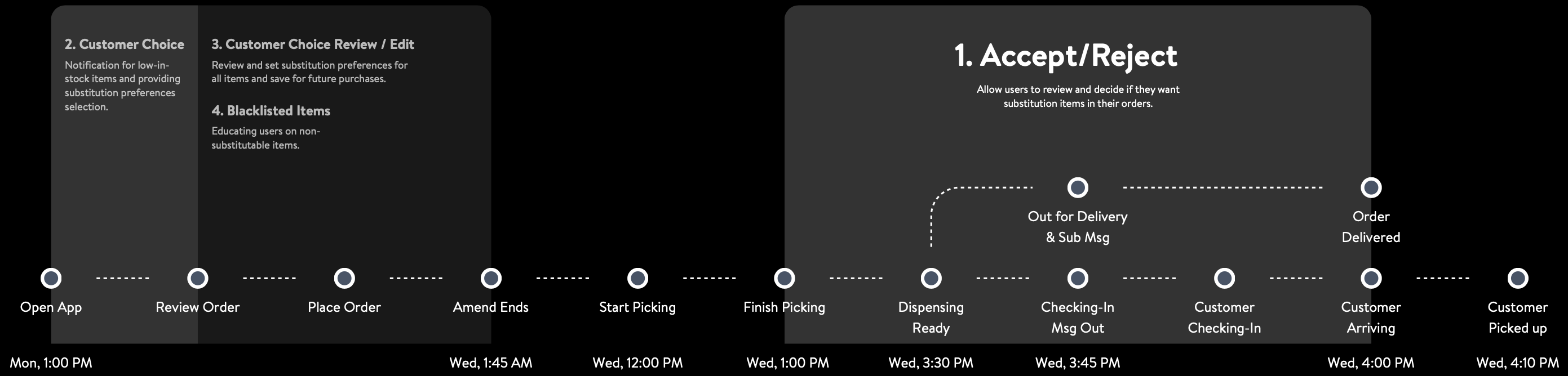
The solutions spanned four moments on the timeline; in the design they resolved into three surfaces. The last two — live substitution updates and the return entry — are one continuous post-order screen, so the four-part journey became three design layers, addressing three of the seven insights through the post-substitution flow.
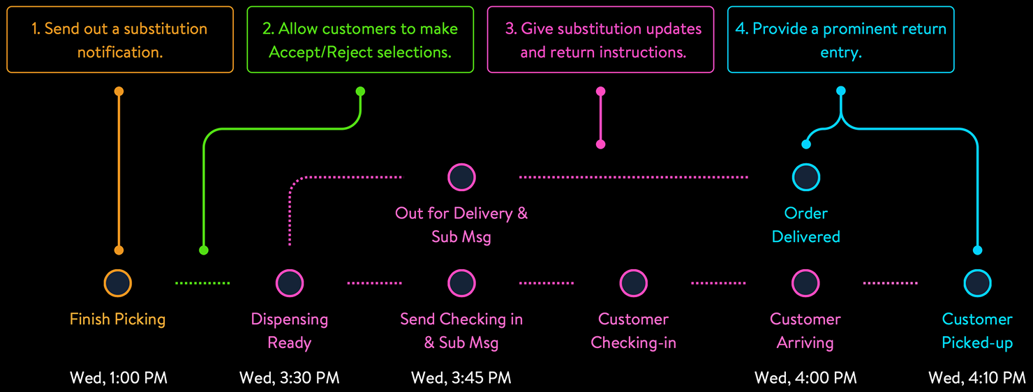
Four moments of Accept/Reject design
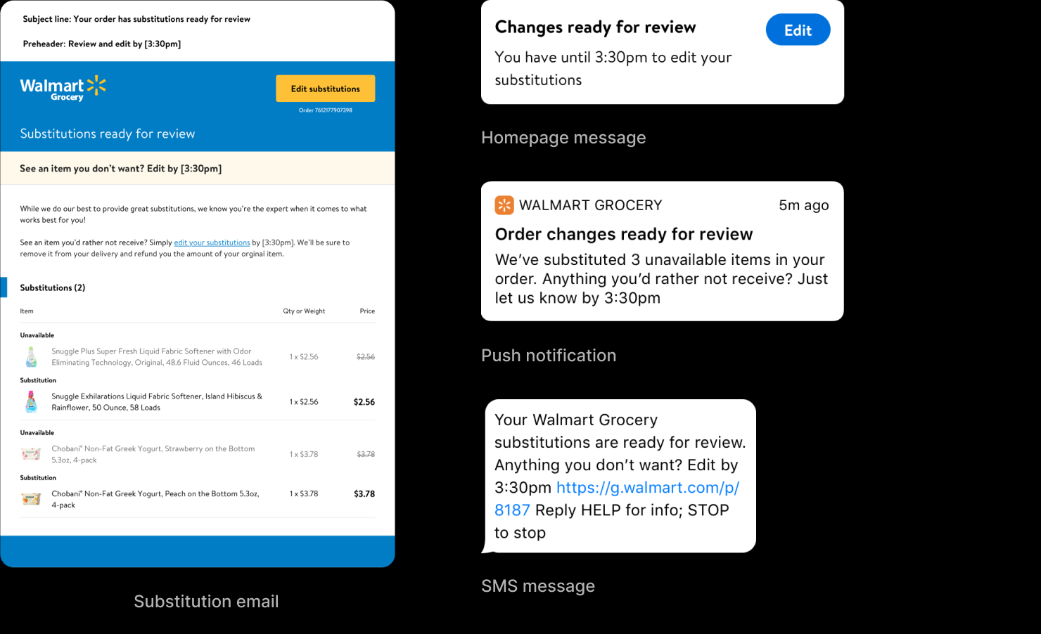
Notification
Addresses: “I would love it if I could receive a substitution notice before my pick-up time” (worst pain) — Insight #4
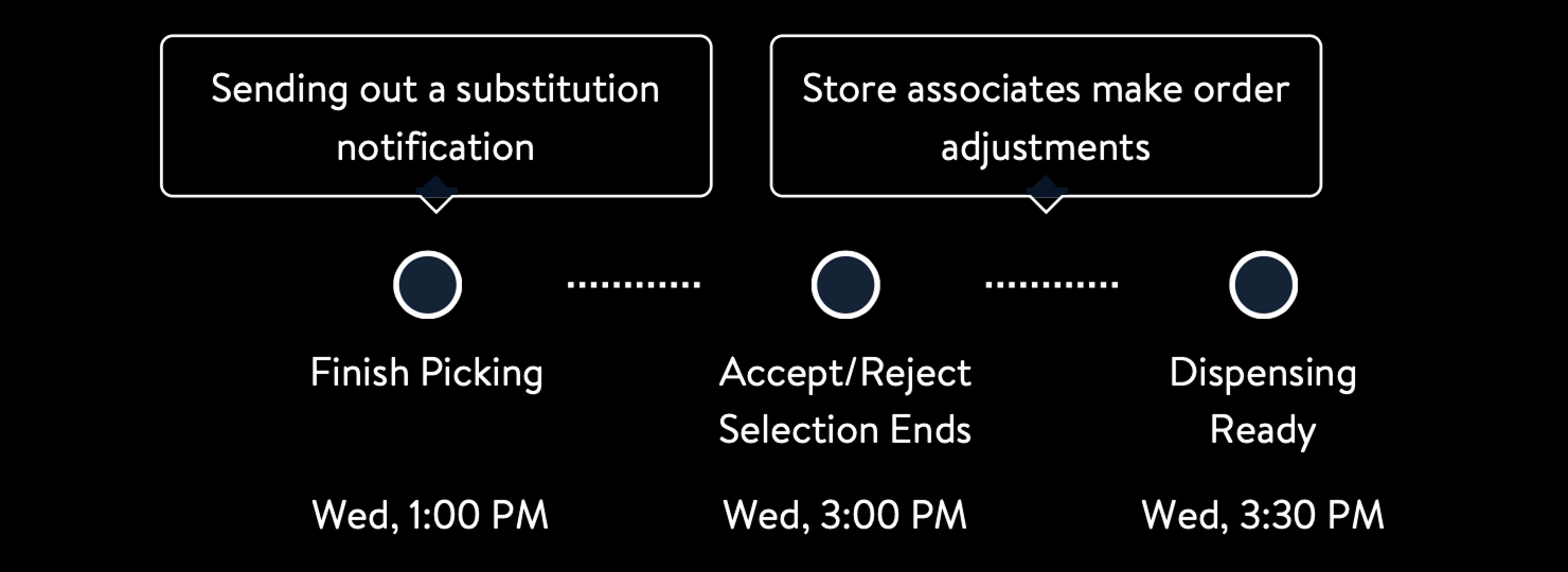
Pushed the moment picking finished — 2.5–3 hours before dispensing. That cleared the 30 minutes to an hour customers said they needed to respond, and still left store associates a buffer to act on rejections before the order went out.
Delivered through SMS, push, email, and a persistent homepage message — at least two forms of notification for every customer, selected by order type and platform. Research showed customers welcomed SMS interruption for grocery orders: they considered grocery important enough to be worth interrupting their day for.
* Most customers request at least 30mins - 1hr to make selections.
* We’ll finish picking 3 hours ahead of dispensing time.
| Platform | Push | SMS | Home Msg | ||
|---|---|---|---|---|---|
| Pick up Opt in SMS |
Web | ✓ | ✓ | ✓ | |
| Apps | ✓ | ✓ | ✓ | ||
| Pick up Opt out SMS |
Web | ✓ | ✓ | ||
| Apps | ✓ | ✓ | ✓ | ||
| Delivery | Web | ✓ | ✓ | ✓ | |
| Apps | ✓ | ✓ | ✓ |
* At least 2 forms of notification for all users.
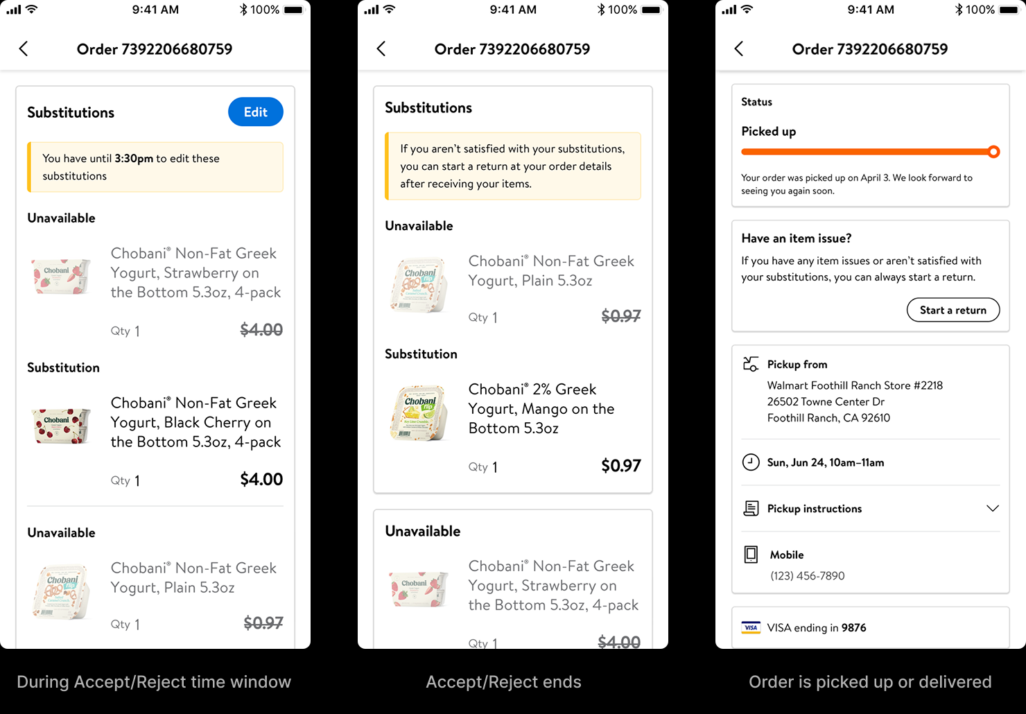
Accept/Reject control
Addresses: “When is the option given to decline substitutions with a delivery?” (worst pain) — Insight #7
A focused screen let customers review each substitution and accept or reject it, with a hard save for confidence and a running order total that updated as they chose. But the screen was only half the design. For a choice to exist at all, the operation behind it had to make room — and to understand that operation, we visited stores and interviewed pickers and store managers to map the actual picking and dispensing timeline. That fieldwork is where the window came from: enough time after picking for customers to decide, enough lead time for an associate to act on a rejection before the order went out. The coordination had no UI — it was service design, the choreography between the customer's tap and the store's workflow. The visible control worked only because the invisible timing did, and we only knew the timing because we went and watched it happen.

Substitution updates and return entry
Addresses: “Will I be charged for substitutions? How do I return unwanted items?” — Insight #2
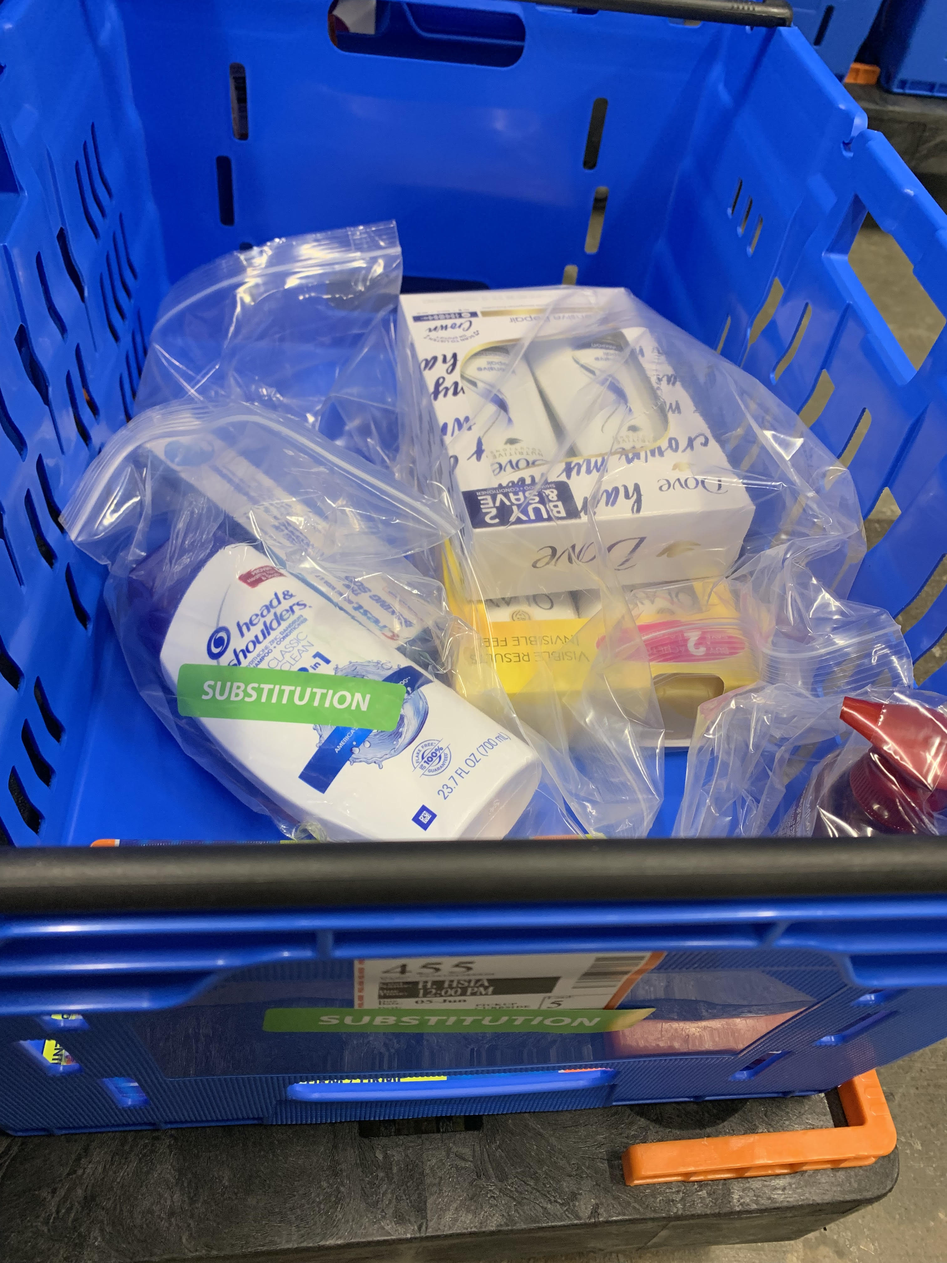
During the Accept/Reject window, a countdown showed how long customers had to edit, and they could keep changing decisions while picking was still in progress. Rejected items kept a strikethrough on their price — making it visible that they weren't being charged for what they didn't accept, surfacing a goodwill that already existed: Walmart absorbed the difference, now stated plainly instead of left invisible. After the window closed, those items moved into an “Unavailable” section so the order stayed legible at a glance. And once the order was on its way — dispatched for delivery or ready for pickup — a prominent “Start a return” entry replaced the edit affordance, answering the other half of the insight: how to send back what you didn't want.
Built in Code, Not Just on Canvas
Three interaction patterns had to be compared for the Accept/Reject flow, and the differences lived entirely in the feel — hard save versus auto-save, the feedback on each tap, the order total updating as decisions were made. None of that survives on a static canvas; you have to put a thumb on it to know which one earns trust. So I hand-coded all three as standalone HTML prototypes with production-grade SCSS architecture — partials, mixins, design tokens. The code wasn't a showcase; it was how the decision got made, and it aligned the engineering patterns before handoff.
Tap to compare the feel
These are live, hand-coded prototypes — best viewed on a wider screen.
User testing was run on InVision prototypes — the right tool for fast iteration and remote sessions where production-grade fidelity wasn't the bottleneck. Option A won — a dedicated page with hard save. The separate page reduced noise around the decision, and the explicit save action gave customers confidence their choices were recorded.
Five Years Later
The Accept/Reject architecture is still in production, having migrated through Walmart's app consolidation into the unified Walmart One app.
The other four insights — #1, #3, #5, #6 — remained. They required intercepting earlier, before substitution decisions were made. That became the second project.